I attended a GDG Muncie meeting over the Summer where I was lucky enough to win an LG G Android Wear watch. The longer version of the story is that the organizer was trying to determine the best way to generate random numbers for the lottery, and I suggested one of my very favorite sites on the Internet, random.org. He went to the site and generated my number: the system works!
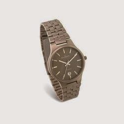
I normally wear a watch—a Skagen titanium watch, to be precise. It is ultralight and quick to don or remove, both of which I consider to be great benefits. This is my second watch of this model, in fact, after having smashed the face of one on vacation several years ago. For those who don't know, I don't have a cell phone plan: the Nexus 4 I carry everywhere is used strictly as a pocket Wi-Fi device. Hence, my watch is not a fashion accessory, it serves an important function, and being so light, it does so innocuously.
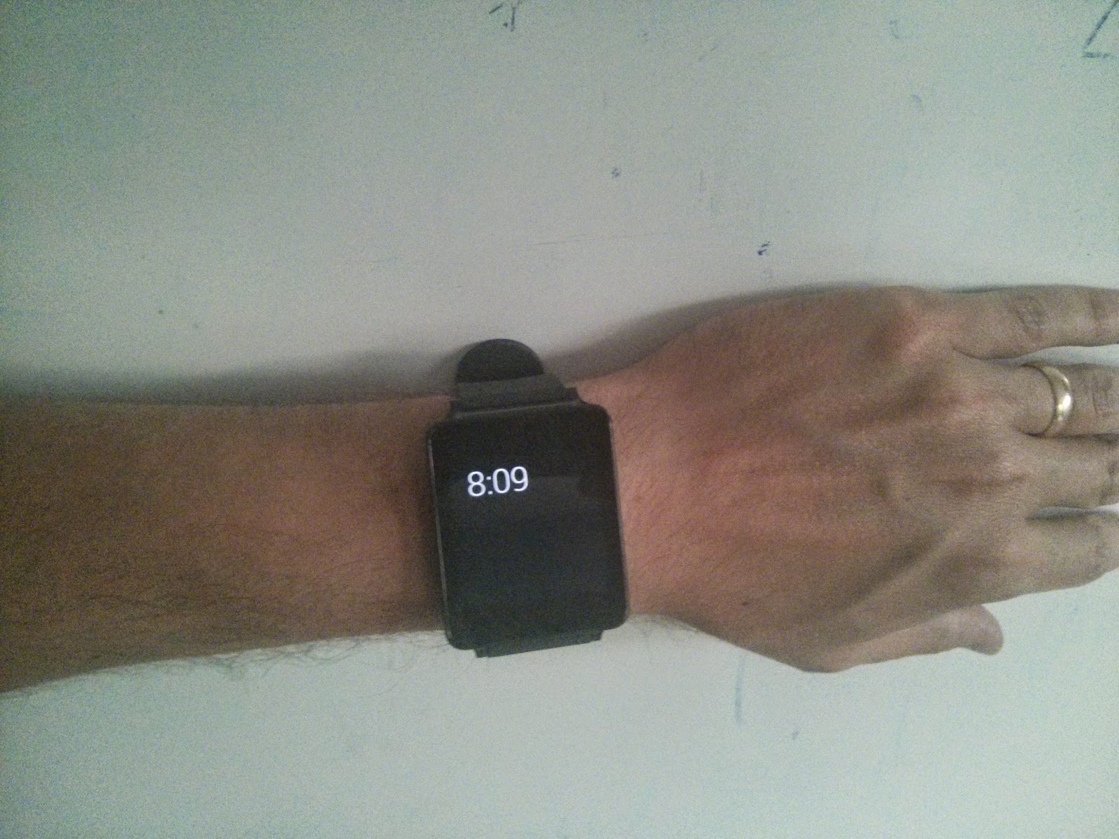
My LG G arrived a few weeks after the GDG meeting, and I decided to wear it around the house for a few days. It is clunky and heavy, especially in contrast to my usual watch. I'm not hip to the technical terms for watchbands, but while the band is functional, it is fiddly, so it takes a few moments to put on or take off. Again, I am not interested in the piece as a fashion statement per se, but I think the picture shows how my rather thin hands and wrists are dominated by this piece of black technology.
It was easy enough to set up and sync with my Nexus 4. I like that the watch face can be configured to show the time, the date, and some ambient information, such as the temperature. I was afraid that the notifications system would be distracting, but I find it no less distracting than my pocket device, really. When I want to know whether I have new email, for example, I simply check. When I am in a situation where I don't want to be interrupted, I am not generally checking my watch for the time anyway: I am either in a situation where I don't care about the time (writing) or there's a clock readily available (meetings, teaching).
Given that I'm the type to turn off notifications and avoid distractions anyway, I also haven't found it to be that useful: almost any time I have used it, I could have about as easily used my pocket device instead. Perhaps that's due to immaturity of the platform, but I suspect it has more to do with me not being in the target demographic. All the same, it is kind of fun to check messages on my watch while walking down the hallway to the men's room. It doesn't feel any less isolated or rude than carrying a phone and checking messages in the same situation, but it does leave hands a bit more free. Probably the single-most feature I use on the watch besides time and date is the view of what appointment is coming next.
I do have a major complaint with the email authoring feature. It does feel very futuristic to talk to your wristwatch and have it send a message to someone. However, it is set up so that you narrate your brief message, and then the watch shows you what it recognized and sends it right away. The two times I've tried this, the speech recognition was terrible, but I had no opportunity to stop it before it sent—I was left with that awful feeling of having just sent a nonsensical message. In my opinion, it really needs a 2–3 second confirmation period in which one can stop the process.
Another usability failure on the watch arises from the context in which it is used, and in particular, I wonder if the designers considered users with small children. When my toddler sits on my lap or when I pick him up, his arms reach exactly to my wrists, and he tends to fiddle with whatever is there—a smarthwatch, for example. It's a bad feeling to be sitting happily with a child in lap and then suddenly realize that he may have knocked messages out of your inbox. The device really needs a hardware switch that turns on or off the touch-sensitivity, or it should come with a warning, "Not for parents of young children." I've started wearing it only on days when I am working from campus, and around the house, I stick with my Skagen and pocket-device.
Preliminary conclusion: It's a fun toy with a few good uses and a few usability problems. I would not buy one, but I am happy to tinker with one. I do have an idea for an app that I may experiment with in the next few days, but that depends on how the semester gets rolling.
UPDATE (8/29): A crazy thing happened this morning, the day after I posted my review. I checked my messages while walking down the hallway to work, and a colleague sent me a question that could be answered either "yes" or "no." I figured, how badly could the speech recognition mangle that? I hit "Reply" on my watch, and the voice recognition screen came up with the "Speak now" prompt. Then I swiped or tapped or something... I am not really sure what I did, which itself is interesting... and I got a "Yes/No" dialog. I hit the "Yes" button and an email was sent with exactly that content.
That is neat. I need to wait for someone else to send me an email that I can answer in one word and try that again.
Sometimes I post philosophical essays, and sometimes I describe important teaching experiences, and sometimes I reflect on my miniature painting hobby. Today, however, I go to that much more pragmatic use of the blog: writing down how I actually got screencasting to work on my work machine.
I have a Dell Precision T3600 running Linux Mint 17. I switched from KUbuntu to Mint on my work machines last year, when I had some trouble with hardware recognition. Since I've been using KDE for over a decade (from Mandrake to Mandriva to KUbuntu), I use the KDE distribution of Mint as well. It seems this puts me in the minority, as most of the Q&A I see online assumes one is running something newfangled.
I have USB Logitech headphones that used for the screencast. After a bit of fighting with my mixer, I was able to get the microphone to work: the system wants to default to the hardware ports, even when there's nothing connected there. Audacity makes it very easy to test the sound configuration, and so I was sure that the microphone was working.
However, getting that microphone to work through screencast software was another problem entirely. I had no luck with the old standard recordmydesktop at all: video capture was fine, but the audio came up with nothing. A bit of searching revealed some newer applications I had never heard of. Vokoscreen had a reasonable user-interface with several configuration options, and I was confident enough to record an 11-minute take. Unfortunately, upon playing back, the audio was terribly choppy. I spent quite a bit of time fiddling with the framerate and pulseaudio settings trying to fix this, since otherwise Vokoscreen was convenient to use, but a tutorial with no audio is hardly a tutorial at all. Since the mic was working fine in Audacity, I inferred that it was a software problem, not a hardware problem.
I switched over to Kazam, and this ended up doing the trick. It allowed me to select an area of the screen where I could hop between Eclipse, Chromium, and the console, and the audio was captured with no trouble. The default file format uploaded flawlessly to YouTube, and I was able to share the video with my students. I had actually tried Kazam before Vokoscreen, but it wasn't working—turns out it was because I had the mixer settings for my mic much too low, and they needed to be at almost 100%. (Recordmydesktop still did not work with this fix, incidentally.)
The screencast itself is just an explanation of how to set up a PlayN project and hook it up to a Mercurial repository using the Computer Science Department's Redmine server. Hopefully next time I want to do an 11-minute screencast, it will take less than two hours of tinkering.
This is the second part of my series of posts in which I reflect on painting the miniatures from Dungeons & Dragons: The Legend of Drizzt Board Game. In Part 1, I described my experiments with a few different techniques and ended with descriptions of some of the unique characters. The Drizzt set is the second collection of miniatures I have painted since my 20-year hiatus from the hobby, the first collection being Mice & Mystics—a painting experience documented in my January post.
I make sure to take pictures of all the miniatures I have finished, and I often take work-in-progress shots of interesting or challenging pieces as well. Using my Android phone, these get automatically backed-up to Google+, where I write my notes about techniques and colors. I also frequently use the image editing tools in Google+ to do some white balancing, and I find the "Lift" option combined with increased brightness makes up for my budget camera and lighting setup. (My only criticism is that these editing tools do not work in Linux, and so I have to run in Windows just to take good painting notes.) I mention this in part because I have had the Drizzt figures complete since May and have begun my next painting project; I am glad I took the notes, as they remind me of my focus at the time.
I left off my last post with this picture, the first step of an experiment with priming miniatures in white or black:
Let's revisit these characters in the painting process, starting with Guenhwyvar. Prior to painting her, I came across a post (maybe this one, though I do not remember so well now) explaining that one rarely paints in pure black. Guenhwyvar then is my first experiment in non-black black. The base coat is almost black with a bit of purple, and the drybrushed highlights are greys tinted purple. The base also has hints of purple, a color that was chosen in part to match my plans for Drizzt himself. The only pure black on this model is in the pupils and the roof of the mouth. I am pleased with the result.
The other black-primed figure was Yochlol, who I decided to build up in layers following the technique described by Dr. Faust. This figure also marks a change in my work lightbulb, switched to a Cool White Ecobulb (1170 lumens, 4100K), which gives much better light although also generates quite a bit more heat. Yochlol is really just a series of layers from yellow-brown up to yellow-white, as can be seen in little montage. I remember at the time feeling a bit silly covering the whole model in each subsequent layer, as opposed to a lighter base coat and using a wash to get in the cracks. However, it was a good experience to practice layering on this model, given that it's basically a blob of slime. If I could do it again, I would probably have it be a bit less brown, but I'm still pleased with the smoothness of the result.
For Athrogate, I tried to model his color scheme after a wild boar, inspired by his pet boar, Snort. I remember being happy with his base colors but thinking he was rather dull, and I was nervous to add highlights. I am glad I faced my fear and added the highlights, because I think it turned out great—and it's another novice fear eliminated!
Next up is Artemis Entreri, whom it seems we face every time we play a random-villain game. I was never really happy with his face, which came out kind of splotchy. This was also the first miniature I did after buying some glaze medium. I tried giving his vampiric dagger a red glaze, but it came out comically pink and was painted over. On the cloak, there was too much contrast between the highlights and shadows, and so I tried a glaze there, but I think I used too much medium. The result was an accidental "clothy" effect, which is not horrible but also not what I wanted. Long after working on this figure, I came across some tips on how to get cloth effects with sponge painting, and I think that's what I will try next time I approach a cape like this. All told, Entreri is passable, but not great.
Looking back at those four, it's hard to tell that the primer made any difference at all in the final model. Artemis Entreri does look darker than the rest, but he was also supposed to look darker, so I cannot say the primer was a major issue. My experience was that white lends itself to a painting sequence of mid-tone, wash, and highlight, while black works well for building up from dark tones (although I usually end up needing a pin wash to bring out the contrast at the end in this technique anyway). Based on this, I moved forward with white primer for the rest of the figures in this set.
I had been waffling with respect to the sequence of basing and priming, and I had also been experimenting with different primers. One thing I tried was basing first (with a mix of three sizes of ballast held down with thinned white glue) and then priming with my Vallejo White Surface Primer, which I brush on. I took this picture to show how it cracks after drying and shrinking (white minis on right), although the final effect isn't too bad (Entreri on left).
This next picture shows the streakiness of brushing on this primer, which I found annoying although, as you'll see, did not seem to effect the final paint job.
That inspired me to do some more reading about brush-on primers. I think I mentioned before that I was unsatisfied with my spraypaint experience when working on the Mice & Mystics figures, in part because of weather restrictions. After watching this video about using gesso as a primer, I thought I would give it a try.
Nice video, eh? Damned lies, I say. I bought some white Liquitex Gesso and tried it on Bruenor.
Looks like he fell in a pool of chalk dust. It took a bit of scrubbing to get him cleaned up again. (A note from the future: I have recently returned to the Gesso in my priming experiments, and it seems to work well when put on in thin layers, avoiding the "glop it on" advice from the video's article. However, I also realized that the gesso I have is leaving noticible texture on flat areas of my models. It doesn't look too bad on armor, but is not what I wanted. I also realized that I have the "Basics" line of Liquitex gesso, and I wonder if the particulate is less finely ground for the cheaper line. Sadly, I have yet to find any information to confirm or deny this, otherwise I would consider buying a new bottle of the higher-quality stuff—but that's not worth the gamble to me right now.)
Here is the finished Regis, who turned out pretty well.
Cattie-Brie was an interesting model. It looked like the miniature was based on this iconic painting of the character:
However, I didn't really want my son's first experience with a human female adventurer to be a leather bikini, and also, the arms had a "puffiness" that implied sleeves. I decided to give her a purple shirt, to go well with the green cloak and red hair. The blue gem on her sword is designed to bring out the blue in her eyes. I think the figure turned out well, especially considering that the miniature itself lacked a lot of definition.
I used a similar color scheme on Cattie-Brie as on her adopted father, Bruenor Battlehammer. This figure was my first to use my gold paint, and I followed some of the advice given in this article. I am quite pleased with the result, and I think it might be my favorite one from the whole collection.
Here's Wulfgar, on whom I got to practice drybrushing fur texture, layering skin tones, and 1980's heroic blonde hair.
"Hey," you ask, "Where's the star of the show?" The last hero I painted was Drizzt himself, painted to match the color scheme on the game's box. Turns out, though, that it was kind of a bad figure. The sword in his left hand and the cloth down his front are molded all the way back to his cape, and I found him generally uninteresting. He has the same problem as the other drow from the set: he's just plain dark. Oh well, they can't all be Bruenors.
With all the small figures done, I was left with only big monsters. Some of these had rather significant gaps: looks like they were cast in multiple pieces and hastily assembled. I picked up some Milliput and decided to try my hand at both filling gaps and crafting some more interesting terrain. Following the instructions, I worked together the two colors of epoxy, and then formed some rocky bases for the trolls and dragon and filled some gaps in the balor. I found out much later that my Milliput is probably too old: both rolls are discolored and chalky. Still, it worked well enough for this purpose, but if I were to do any more serious modeling, I should probably discard it and get some more workable putty.
The two feral trolls were tedious to paint. Their skin lacked meaningful texture aside from very shallow muscle shapes and a few warts. I also was painting them using a number 2 brush, and by the time I got the skin done, I was tired of painting them. The end result is somewhat uninteresting, but certainly passable for tabletop quality. In fact, looking back over my photos, I have two sets marked "final." After having them sitting on my desk for a few days, I decided they needed more highlights, so I touched them up and re-varnished. This one has some sloppiness on his right pectoral area, but this was a serious case of diminishing returns. They still look intimidating no matter who they face. I am glad I added the lumps to the ground, just for a bit of visual interest.
Shimmergloom was much more fun, and exercise in shades of grey. The highlights were added to each scale individually, and I think they add a lot of depth.
The last figure of the set was Errtu the Balor, and calling this a "miniature" seems like an abuse of the term. He is huge. I ran into the same problem as with the trolls: it took an enormous amount of paint and time just to do uninteresting things like cover his wings with a solid color, and he's mostly monochromatic. I decided to do most of the shading with washes for expediency's sake.
When I finally got to the weapons, I got my second wind. According to the game rules, he has a flaming whip and a lightning sword. A Hot Lead article to me thinking about how to do the fire whip in a realistic way. Indeed, before reading the article, I was thinking about making exact mistake he points out and working the fire up to white instead of keeping the white at the hottest point. The sword is a "lightning sword," and I took inspiration from a BoLS article on painting science fiction power weapons. Errtu's sword was not a smooth surface, however, and I decided to try to make the edges look like the lightning strikes and the rest like clouds. Never having seen a real lightning sword in action, I figured this would be reasonable, and I am happy with the result.
Writing this up, I realized that if you haven't played the game, you might not have a sense of scale of the balor, so I took this shot of Errtu about to consume the soul of Artemis Entreri.
One of the reasons I put off finishing this blog series (despite having finished the painting months ago) was that I had hoped to get some in-game photographs in good lighting conditions. However, we have only played the game once since I finished painting the figures, and that was mostly because my brother was visiting. It looked great, but my son and I had sort of "played out" this game already.
I learned my lesson: paint the figures before playing the game! I picked up Dungeons & Dragons: Wrath of Ashardalon, which is from the same series as Legend of Drizzt, and I have enjoyed painting those figures. That, however, is a story for another blog post.
Thanks for reading! As always, feel free to leave comments below.
I returned home from a fantastic two-week vacation and formalized my ideas for this Fall's Game Programming course. The course is CS315/515—a cross-listed course for Computer Science undergraduates and graduate students. Although I have taught game programming many times and in many forms, this is my first time teaching it as a "regular" course with full enrollment. I have previously either had low enough enrollments to treat the course as a seminar, or I have had special projects by which I was able to restrict enrollments or require an application process. This Fall, I will have a full room of about thirty students. This is too many to run a seminar or studio model, and so I needed to set up something more structured.
The undergraduates have CS222 as a prerequisite and so will come in knowing a bit about working in teams, code quality standards, human-computer interaction, version control, and requirements analysis. I decided to build on this by borrowing from the structure of CS222 itself: I will have the students doing individual work the first few weeks as we work through the basics, and then the majority of the semester will be spent on team projects built in multiple iterations.
For each of the first five weeks, I will use Monday as a day for me to share new ideas, Wednesday to workshop with the students, and Fridays will be their day to show off what they did. The sequence of topics is image manipulation, animation, collision detection and processing, user interfaces and interaction, and finally, a quick introduction to the entity system architecture for game development. With so many students, we won't have time for each person to give a formal presentation to the class, so instead it will run like a poster session. I decided to award some course credit for completing peer evaluations during this time in order to foster communication. I anticipate that this interaction will help the students find teams with similar interests for the major semester project.
The project itself will be to recreate a game for HTML5 using PlayN, which has recently been my platform of choice. We won't be spending any significant time on game design, and so I am pushing students toward classics from the golden age of arcade games. Of course, few of these students will have lived through the arcade era or the 8-bit era. To get around problems of over-ambitious designs, I am requiring the students to submit both a game concept and a game proposal. These will be in Tim Ryan's format, which I have used many times in the past for game concept documents but never for game proposals. I expect I may get proposals drawn from more modern casual genres, such as match-three, but I need to ensure that they don't think they can create Chrono Trigger in ten weeks.
I wanted to include peer evaluations during the project portion, but I was afraid of creating a mountain of paperwork. Blackboard's peer assessment support is insufficient for what I want, which is to take my peer evaluation rubric and automate it. In my search for any useful Blackboard tool support, a conversation thread informed me of TEAMMATES, which looks like it will fill the bill. My account was activated this morning and I tinkered with it for a few minutes. It looks like it will easily let me input my groups, enter my rubric, and then assign it for both self-evaluation and group-peer-evaluation. Students do not need to register on the site: they are sent emails with individualized URLs for their forms, based on the schedule specified for the assessment. I will try TEAMMATES in CS315/515 as well as CS222, and I'll be sure to write something about the experience once I get it rolling. As in CS222, I am planning to give each team member a grade for each iteration, and this grade will be the minimum of the increment evaluation and their peer evaluation—an approach that I hope will ensure all team members are contributing and that the work is of high quality.
This finishes my series of summer course revisions (Part 1, Part 2), and I feel ready for the semester. Having my planning done gives me some time to catch up on my painting and do a few more fun summer activities with the family—both of which are good things. Interested readers are welcome to take a look at the CS315/515 course description, and as always, I welcome your comments.